Windows 11 version 22H2: It’s been nearly a year since Microsoft released Windows 11, and the company has been hard at work “polishing” its vision for this era of Windows. The big bang new release last year had a brand-new design, sounds, animations, and features. This year is all about improving those experiences so that the next version of Windows is the best yet.
Microsoft has focused on completing Windows 11 by restoring some missing functionality, introducing new productivity features such as snapping layouts and tabs in File Explorer and improving existing features such as the new Start menu, focus assist, and the Taskbar.
What’s New on Windows 11 Version 22H2
Here’s a quick rundown of the most notable new features and changes included in Windows 11 version 22H2:
- App folders in Start menu
- Resizable pinned area in Start menu
- Drag and Drop on the Taskbar
- Focus Assist integration with Notification Center
- New “Spotlight” wallpaper feature
- New Voice Access accessibility feature
- New Live Captions accessibility feature
- New gestures and animations for touch users
- New snap layouts bar when moving app windows
- New Task Manager app
- New “Suggested Actions” feature when copying dates/numbers
- Tabs in File Explorer
- Better OneDrive integration with File Explorer
- Numerous UI improvements and consistency updates
You may also like: Windows 11 digital licenses now available on Microsoft
Windows 11 Version 22H2 Start Menu
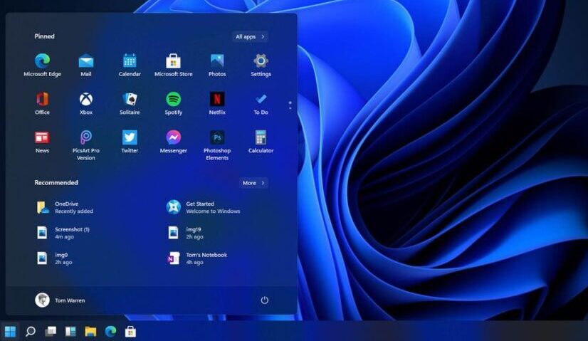
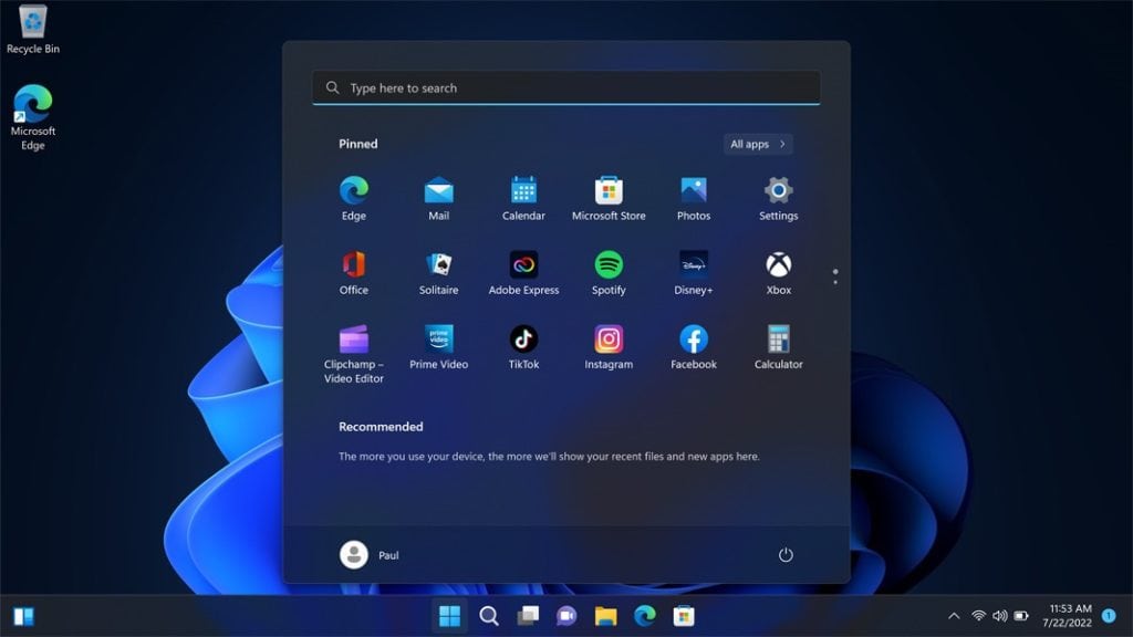
Microsoft introduced a brand-new design for the Start menu with the first version of Windows 11, which had been rebuilt from the ground up with simplicity in mind.
Microsoft has added a couple of notable updates to Windows 11 version 22H2 that improve the customizability of the pinned apps area. Users can now create app folders and resize pinned apps to display one more or one fewer row.
Creating app folders is as simple as dragging one app icon over another, waiting a few seconds, and then letting go to make the folder. Users can then rename the folder, reorganize apps within it, and move it around in the pinned area of the Start menu. It’s a simple, clean experience that does the job and contributes significantly to making your Start menu feel less cluttered.
The ability to resize the pinned area is also a nice addition, though we wish it was more fluid. Currently, resizing the pinned area in Start necessitates going into Settings, and then choosing between showing one more row of pinned icons or one fewer row. Choosing either will also reduce or increase the Recommended feed that sits beneath the pinned area.
This means that only the elements within the Start menu are resized, not the entire menu. Furthermore, unlike in Windows 10, users cannot simply drag the edges of the Start menu to resize it, which is a little annoying.
You may also like: Best Windows 11 themes and Skins
The Snap Assist
Version 22H2 also adds a third way to start snap assist on Windows 11. Version 22H2 adds a new “snap bar” menu that drops down from the top middle of your display whenever you grab an app window to move it, in addition to the drop-down snapping menu that appears when you hover over window controls and the ability to drag app windows to the far left or right of your screen.
When you begin to move an app window towards the top portion of your display, the snap bar will “peek” out at the top of your screen before fully revealing itself and allowing you to drag your app window into any of the snapping layouts available. The more snapping grids you have, the more snapping grids you will have.
With the 2022 update, you can still snap apps by dragging an app window to any edge of your display to initiate side-by-side snapping, or by hovering your cursor over an app window’s maximize button to see your available snap layouts.
Taskbar and Action Center
The ability to drag and drop files between apps using the Taskbar has been restored in version 22H2; the ability to drag and drop files between apps using the Taskbar has been restored! This greatly simplifies multitasking with the Taskbar and restores functionality that was previously available in older versions of Windows.
Apart from that significant improvement, the Taskbar hasn’t changed much since version 21H2. It’s still a simpler take on the Taskbar UX, which I’ve grown to like and even prefer over previous versions of Windows’ more complex Taskbars. You can’t move the Taskbar to the right or top of the screen, and the right-click menu remains empty.
The Action Center has also received several notable updates and changes, beginning with the “focus assist” button, which has been relocated from Quick Settings to the Notification panel, where it makes more sense, and renamed “do not disturb.” Under the calendar flyout, Microsoft has also added a new “focus” timer.
The focus timer works in conjunction with the Windows 11 Clock app, which can also sync with Microsoft To-Do lists and Spotify. It’s convenient to be able to start a focus session directly from the notification center, which simplifies the process of starting the timer. Users were required to launch the Clock app to begin a focus session in version 21H2, but this is no longer the case.
Finally, Microsoft has improved the Bluetooth action in the Quick Settings panel by allowing you to view and manage Bluetooth devices without having to launch the Settings app first, which is fantastic and brings it in line with other Quick Settings actions like Wi-Fi and accessibility.
Overall, the changes and improvements to Windows 11’s Taskbar and Action Center areas are nice quality-of-life improvements that you would expect from an update that comes a year after the first one. Some may be disappointed that older functionality, such as the ability to move the Taskbar, has not been restored, but I personally don’t miss it.
At this point, the absence of classic Taskbar functionality appears to be a deliberate design choice rather than an oversight and to be honest, I prefer it that way. I like how simple Windows 11 is, and I don’t want the Taskbar to become a cluttered mess like it was in previous Windows releases.
You may also like: How To Install Windows 11 on Mac with BootCamp
File Explorer
With Windows 11 version 22H2, File Explorer gets a slew of new features, starting with the new “Home” page, which is now the default when you launch the app. The layout has changed slightly, with a new “favorites” and “recent” section below your usual quick-access folders.
Surprisingly, Microsoft has relocated your user folders from the “This PC” page, which now only displays storage drives. As a result, if you want to access your user folders, you must use the new Home page or the sidebar. This change took some time to adjust to, but I’m now completely comfortable with the new Home page.
The ability to pin files to the favorites area on the Home page keeps them front and centre for later access. The recent area functions in the same way as the Recommended feed in the Start menu, but without shortcuts to recently installed apps. As a result, any files you open will appear here.
Fortunately, you can disable the recent feed-in File Explorer if you find it clogging things up, which I frequently do because it shows all files you’ve opened, including ones you probably don’t need to open again.
The sidebar UI has been updated as well, with a slightly different layout that places the Home page and OneDrive folders at the very top, followed by your pinned and most used folders, and bookended by “This PC” and “Network” drives. As a result of the new layout, things look cleaner and are a little easier to navigate.
In addition, there are a few OneDrive improvements to File Explorer. If you use OneDrive more than local storage, you can now make it the default home page for File Explorer. There’s also a new sync activity indicator in the top right that shows available cloud storage and files that are syncing or were recently synced. This is compatible with the OneDrive flyout in the System Tray.
There’s also a new “open with” dialog design that matches the rest of the Windows 11 design language. It has a subtle blur effect and rounded corners, and overall looks fantastic. It’s functionally identical to the old one; it’s just prettier now, which is a good thing.
Finally, Microsoft is adding tabs to the File Explorer app, which has been requested by power users since the dawn of time. It’s finally happening with version 22H2, and it works perfectly. A row at the top of the app allows you to open new tabs and switch between them.
The actual tab functionality is currently lacking. For example, unlike most web browsers, you cannot drag tabs between File Explorer windows, nor can you group tabs as you can in Edge. However, the essential functionality is present and functions as expected.
It’s worth noting that it’s unclear whether tabs in File Explorer will be available when version 22H2 is released or if they’ll be added in a later update. It will undoubtedly be included in the version 22H2 release at some point; we just don’t know when it will be available to most users.
You may also like: TPM 2.0: How to fix Windows 11 TPM error
Accessibility
Microsoft has taken pride in its advancements in accessible design over the last few years, and that trend certainly continues with Windows 11 version 22H2. Microsoft has added a new “voice access” feature with this release that allows you to control your PC entirely with your voice. Similar features have existed in previous versions of Windows from Microsoft, but nothing this advanced.
When you enable voice access, a narration bar will appear along the top of your screen, and you’ll be able to use your voice to navigate Windows. Common commands like “open Start” and “scroll Edge” function as expected. You can even move the cursor to specific locations on the screen and type sentences into text boxes using your voice.
The other new accessibility feature coming to Windows is one we’ve seen on iOS and Android before: live captions. Users can enable captioning on any content with live captions, which appears and works system-wide in any app. Furthermore, the captioning AI is entirely offline, so it does not require an internet connection to function.
Windows 11 Version 22H2 Settings
As with all new versions of Windows, there are new Settings to experiment with. The most notable new setting is the addition of a new “Spotlight Wallpaper” feature, which will automatically pull in new wallpaper and set it as your desktop background daily. It’s a nice addition that works in the same way as the daily Bing wallpaper on your lock screen.
The other notable new setting is under Clipboard. When enabled, suggested actions will present you with a small menu whenever you copy a date or phone number, offering quick actions to deal with that data. For example, if you copy a date, a suggested action with buttons to add that date to your calendar will appear.
Unfortunately, the feature is currently only available in the United States and Canada. Microsoft says the feature will be expanded to more areas and languages in the future. Furthermore, the feature will not be available to everyone on the first day. It will be included in a future update for version 22H2.
Windows 11 Version 22H2 Apps
With the 2022 update for Windows 11, Microsoft has updated and added several in-box app experiences, beginning with Task Manager, which has finally been updated with a brand-new design that brings it in line with the rest of the Windows 11 design language. The last time the Task Manager UI was updated was in Windows 8, which was over ten years ago!
The new interface includes a sidebar on the left that houses all of the tabs that Task Manager has always had. From the hamburger menu, you can access your processes, performance, app history, startup apps, users, details, and services tabs.
End task and run new task actions have been relocated to the top right corner, just below the window controls. Microsoft has also made the graphs in the performance tab match the color of your system accent, which is a nice touch.
Microsoft is also including two new apps, Clipchamp, and Family Safety, with the 2022 update. Clipchamp is a new video editor acquired by Microsoft last year that is entirely web-based. The app is functional and adequate for basic video editing for beginners looking to create online videos. There are two tiers: paid and free, with the paid offering more stock footage and effects as well as cloud storage.
The new Family Safety app is also a web app that simply directs you to the Microsoft Family Safety website, where you can add family members, track their location, approve purchase requests, share Office subscriptions, and more.
The Touch Improvements
Microsoft has also made progress in improving Windows 11 for users of touchscreen devices. Windows 11 did away with the dedicated “tablet mode” interface that touch users had grown accustomed to on Windows 10 last year, instead opting for minor tweaks to the desktop interface to make it easier to use with touch.
Microsoft improves this experience for touch users even further with the 2022 update, which introduces gestures that allow access to common system areas such as the Start menu and Control Center with the swipe of a finger. The following are all of the new gestures included in version 22H2:
- Swipe up from the bottom middle of the screen to access Start.
- Swipe right in the Start menu to access the All Apps list.
- Swipe up from the bottom right of the screen to access Control Center.
- Three-finger swipes left or right in the middle of the screen to switch between open apps.
- Three-finger swipes up in the middle of the screen to access Task View.
- Three-finger swipes down in the middle of the screen to minimize all running apps.
Furthermore, all of the gestures mentioned above are now “fluid,” which means Microsoft has worked hard to make those gestures and UI elements involved follow your finger on the screen rather than playing a preset animation. It’s a minor change, but it significantly improves the responsiveness of Windows 11 when used with touch.
Negativitives
Version 22H2 includes several interesting changes, not all of which I am particularly pleased with. To begin, Microsoft is now requiring the use of an online account when installing Windows 11 Home or Windows 11 Pro for the first time. With version 21H2, this requirement was limited to the Home version, but with this update, it is also required for the Pro version.
This means that there is no version of Windows 11 available for purchase that allows users to set up their PC with an offline account by default. If you don’t have an internet connection, you’re out of luck and won’t be able to continue with the setup of your PC. That is, at least, what Microsoft wants you to believe.
There is a workaround that involves opening the Command Prompt and typing a special command, which will then allow you to bypass the internet connection page and set up an offline account. But it’s just annoying that you have to do it in the first place.
I’m a big fan of the Microsoft Account, and I use one on every PC that runs Windows. I’m not here to tell you that having an online account is bad; in fact, I recommend having one on your Windows PC. But I find it absurd that Microsoft is attempting to eliminate the ability to set up a new PC without an internet connection.
No other platform requires you to create an online account. Chrome OS does not even require you to sign in with a Google account; if you want to use it, you can do so in a special guest mode. Apple does not require online accounts on macOS, iPadOS, or iOS, and Google does not require it on Android. Microsoft is the only company that does this with Windows.
Another issue that remains with this release is the inconsistent dark mode experience when navigating the file explorer. Even with dark mode enabled, many legacy parts of the OS continue to use light designs. You’ll be blinded by a white window every time you try to view the properties of a file or access a legacy control panel applet.
I know Microsoft worked on resolving this issue over a year ago. I’m not sure what happened to it, but I wish they’d hurry up and finish it. This is one of the things that prevents Windows from feeling “finished.” On that note, the Taskbar thumbnail previews for running apps no longer have the animations that they did in previous versions of Windows.
When you use a trackpad or touch screen to switch between virtual desktops, a completely broken animation appears. UI elements appear and disappear in front of the user, making the interface look terrible and incomplete. Given how unfinished this animation is, I’m surprised Microsoft is even shipping it.
Small things like this are ultimately what prevent Windows from receiving a perfect score. When it comes to macOS or ChromeOS, you rarely, if ever, find completely broken user interfaces or animations in the shipping version that comes preloaded on hardware. The public receives what appears to be a complete product, but this cannot be said of Windows.
Windows 11 Version 22H2 Availability
This fall, Windows 11 version 22H2 will be made available as a free OS update to existing Windows 11 users. We anticipate that the update will be released gradually, with the general availability date set for September 20.
You may also like: Best Windows 11 Antivirus Software
Conclusion
Windows 11 version 2022 is a more complete version of Windows 11 that was released last year. It’s more balanced, consistent, and feels more stable. The additional productivity improvements are welcome, and Microsoft intends to keep updating this release with new features until 2023, so it can only get better.
That said, the fact that Microsoft requires online accounts even on Windows 11 Pro bothers me, especially since none of the competition requires it on their respective platforms. There are workarounds, but this is the type of thing that shouldn’t require one if you don’t want to use an online account.
Its so disappointed that Microsoft didn’t fix the aforementioned animations, and it’s almost criminal that this release still lacks a full dark mode. The Windows 11 2022 update is expected to arrive in the coming weeks, with additional new features arriving in the coming months and throughout 2023.
Would you like to read more about Windows 11-related articles? If so, we invite you to take a look at our other tech topics before you leave!
![]()


