
In due time, the search engines encouraged the businesses to enhance the mobile user experience of the websites. Now, the need is to have a mobile-first approach. In this way, Google gives priority to the mobile versions for indexing both the mobile and desktop results.
Optimization for mobile went from being a good idea to a standard best practice. If your website isn’t mobile-friendly, then well, you’re falling pretty far behind the curve.
The company expanded search performance features in Google Search Console-known at that time as Google Webmaster Tools-including mobile performance metrics as early as January 2014. Later that year, it incorporated mobile recommendations into PageSpeed Insights.
In March 2015, an update nicknamed “Mobilegeddon” by many SEO experts prioritized websites that displayed well on mobile devices.
This guide explores everything you need to understand about mobile SEO and how to optimize your website to meet today’s mobile-centric requirements.
What is Mobile SEO?
Mobile SEO is the method of making a website search engine visible and user-friendly on mobile devices. It includes a few strategies and techniques that would help in making a website accessible, easy to use, fast enough, and providing relevant and quality content to mobile users.
Mobile SEO has to do with website design and content, page speed, user experience, and technical elements used to optimize a website for better rankings in mobile search, thereby increasing organic traffic coming through the use of mobile devices.
This is a type of SEO that encompasses not just improving search rankings, but also involves improving mobile user experience through content and technological enhancements. While Mobile SEO does borrow many of its principles from traditional SEO, it requires added considerations-like site rendering and content optimization-for the specific needs of mobile users and the velocity expectations of mobile devices.
Does your website focus on Mobile SEO? How important it is, let me put this way: 58% of all web traffic around the world is provided by mobile users. Neglecting them means one is losing a lot in terms of traffic. That means, starting in 2023, mobile-first indexing will mean that the crawlers are shifted and the mobile experience will grow in importance for proper indexing-the predecessor to any ranking algorithm.
Best Tools for Google’s Interaction to Next Paint (INP) Metric
How much of your website traffic comes from mobile devices?
The answer depends on several factors, such as your industry (where B2B sites might attract more desktop users, for instance) and the search intent your content caters to (users might prefer desktops for significant purchases, for instance). In spite of these considerations, it is a future-oriented measure to optimize your site for mobile devices anyway.
To get an overview of the current mix of mobile versus desktop users for your website, easily check in Google Analytics 4:
- Go to Reports in the left column.
- Navigate to Reports in the left column.
- Click on the Insights icon on the right side of the screen.
- Scroll down to Suggested Questions and select it.
- Click on Technology.
- Choose Top Device model by Users.
- Then, click on Top Device category by Users under Related Results.
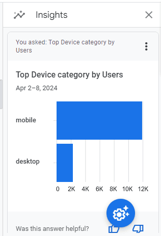
This breakdown of device categories will correspond to the selected date range in GA4, giving you a clear picture of your mobile versus desktop user ratio.
You can also create a report using Looker Studio:
- Add your website to the Data source.
- Device category in Dimension field.
- Add Active users of the past 30-days to Metric field.
- Click on Chart to choose a view that best fits your needs.
You can add additional Dimensions, to drill deeper into the data, to discover such things as what pages certain types of users visit, what is the ratio of mobile to desktop by country, what search engines bring the most mobile visitors, and many other useful data points.
Here’s how you can tell if your website is mobile friendly:
After learning how to create a report on mobile and desktop usage, your next step is to assess your site’s optimization for mobile traffic.
Although Google removed its mobile-friendly testing tool from Google Search Console in December 2023, there are still several valuable tools available for evaluating your site’s mobile compatibility.
Google releases a tutorial detailing how to identify INP issues
Bing’s mobile-friendly testing tool can check:
- Correct viewport configuration.
- Page content fitting device width.
- Readability of text on the page.
- Adequate size and touch-friendliness of links and tap targets.
- Detection of any other issues.
Google Lighthouse Chrome Extension Grades your site in various ways, including but not limited to load time, accessibility, and SEO.
To Use it:
- Install the Lighthouse Chrome extension.
- Go to your website in your browser.
- Click the orange Lighthouse icon in the browser address bar.
- Generate the report.
- When the scan is done, it will open a new tab showing your scores.
You can also access the Lighthouse report through Developer Tools in Chrome:
- Click on the three dots next to the address bar.
- Choose “More Tools.”
- Select Developer Tools.
- Click on the Lighthouse tab.
- Opt for “Mobile” and click the “Analyze page load” button.
Google also provides another option: the PageSpeed Insights (PSI) tool. Just input your URL into the field and click Analyze.
PSI will integrate any Core Web Vitals scores into the generated view, allowing you to understand the user experience on your site. Tools like WebPageTest.org give you visual representation, showing graphically for you which processes occur to load your webpages and how long those processes take.
This information allows you to find out what processes are slowing down the loading of your pages the most, what takes the longest to load, and how each contributes to the total page load time. You can also use Chrome’s Developer Tools to emulate the mobile experience-even toggle back and forth between desktop and mobile views with ease.
Last but not least, try accessing and navigating your site from your mobile device:
- Does it load slow?
- Can you get the important information on your site easily?
- Is it easy to add things to the cart?
- Is the text readable, easy to read?
To further optimize for mobile-first, with these tools focus on the Performance and Accessibility scores, as those will greatly determine how well your website functions on mobile devices. Run through each section of the PageSpeed Insights report to see what exactly is affecting your score. This will give you the details to provide to your developers in order to optimize the mobile experience.
Although mobile speeds on cellular networks have generally improved globally (the U.S. average speed has risen from 11.14 Mbps to 27.06 Mbps in eight years), prioritizing speed and usability remains crucial for mobile users.
Mobile Optimization Best Practices
Best Practices for Mobile Optimization can seem more technically focused compared to traditional SEO, which centers on aligning your content with user needs regarding your products/services. Although content relevance remains crucial, mobile SEO requires collaboration with developers and designers for optimal results.
Consider these key factors in mobile SEO as you optimize your site:
The Site Rendering
How your site adapts to various devices is critical in mobile SEO. The main approaches are responsive design and dynamic serving. Responsive design is the more prevalent option between the two. Responsive design allows your site to adapt to various screen sizes, orientations, and resolutions with the use of cascading style sheets (CSS), flexible layouts, responsive content delivery networks, and modern image file formats on your website.
Responsive design: It’s called responsive because the elements of the page grow and shrink, and sometimes change layout according to the screen dimensions. You can testify this by simply resizing your desktop browser window. Google recommends the responsive design approach.
Adaptive design: Also referred to as dynamic serving, it comprises several rigid layouts that are served dynamically depending on the device of the user. Sites can thus have different layouts for desktop, smartphone, and tablet users, and each design may load only the necessary functions to be displayed for a particular device type.
Though this gives more granular control with device-specific content, it is a less effective process than responsive design.
Other approaches that are not dealt with here include:
- Progressive Web Apps: These can integrate seamlessly into mobile applications.
- Separate mobile site/URL. (No longer recommended).
The Image Optimization As A Factor for Better Mobile SEO
Image optimization means a far better experience for your website users, especially for those on mobile. Poorly optimized images can notably reduce page speeds and image quality, therefore affecting user experience. Images have to be responsive to smaller screens, changing resolutions, or different orientations of screens.
One key strategy is to integrate responsive elements into your website’s CSS. Instead of using absolute pixel values for images, opt for relative units like a percentage of the page width. This practice will ensure that images are responsive on different-sized screens, therefore enhancing user experience in general.
Besides adjusting CSS, one may also update the image file format on one’s website. The newest formats like AVIF and WebP for Android devices offer much better and lossless-compression compared to JPEG and PNG formats.
These new file formats can compress file sizes up to 34% and will dramatically improve the page load time for pages which have much media present on them. If you are using WordPress, you can take advantage of image optimization plugins which can automatically convert your images to next-generation formats. Other platforms such as Wix automatically optimize images for better performance.
Intrusive Interstitials
Google is extremely strict when it comes to intrusive interstitials within the mobile experience, although Google normally talks indirectly whenever it discusses ranking factors or penalties. Intrusive interstitials are really pop-ups that get in the way of a user from viewing page content.
According to John Mueller, Google’s Senior Search Analyst, they want to see the first interaction that a user has after clicking through from the search result, making sure not to use intrusive interstitials.
Google defines some of these as “intrusive” interstitials:
- Pop-ups that obscure the majority or entirety of page content.
- Non-responsive interstitials or pop-ups that mobile users cannot close.
- Pop-ups that appear without a user action, like scrolling or clicking.
Google Interaction to Next Paint (INP)
Google has introduced Interaction to Next Paint (INP) as a more comprehensive measure of user experience, replacing First Input Delay (FID). While FID measures the time from a user’s initial interaction with a page (like clicking a link or tapping a button) to when the browser starts processing event handlers in response, INP takes a broader approach. It evaluates a website’s responsiveness throughout its entire lifespan, not just during the initial interaction.
Note that some actions, like hover-over and scrolling, do not alter the value of the INP while keyboard scrolling and navigation are keystrokes that might well generate events to be measured by INP, although the scrolling as such is not counted.
While scrolling per-se does not factor directly into the INP calculation, indirectly it can. Suppose for example a user scrolls down some content and more content is lazy-loaded from an API. In doing so, the processing to load more content can cause contention on the main thread, increasing the latency of interactions and potentially lowering the INP score.
Bard Is Now Gemini AI As Google Launches New Model and Mobile App
Regarding what constitutes an optimal INP score:
- An INP under 200ms suggests good responsiveness.
- Between 200ms and 500ms indicates room for improvement.
- Over 500ms signifies poor responsiveness.
The most common pitfalls of poor INP scores are as follows:
- Long JavaScript Tasks: Too much JavaScript execution can block the main thread, delaying input responsiveness. To improve this, long JavaScript tasks should be broken down into smaller chunks by utilizing the scheduler API.
- Large DOM (HTML) Size: Starting from a DOM size of roughly 1500 elements, performance during interactive use of a website can significantly deteriorate. The more elements that exist in the DOM, the greater the amount of work the browser does for rendering a page and responding to user input.
- Ineffective Event Callback: Long-running or complex event handlers can significantly raise the INP values. Poorly optimized event callbacks that occur on user-generated events like a click, key press, or tap have a tendency to block the main thread and delay presenting a visible response efficiently. A couple of examples of this could be resource-intensive computations or synchronous network requests resulting from event handlers.
Various free and paid tools will be enabled to troubleshoot issues in INP. Just to get you started, as a good practice, go ahead and take a view of your INP scores for geographical regions using treo.sh. That gives you a very high-level insight into where you may experience the most problems.
The Structured Data
Structured Data plays an important role in determining how your site is represented within the mobile search results while usability and speed, covered in previous chapters complement this.
Search engine results pages (SERPs) look very different compared to the older format of “10 blue links”. They now showcase diverse sections tailored to meet various search intents, including Local Pack, shopping listings, videos, and more, making the mobile search experience richer.
Therefore, it’s important to implement structured data markup on your site. This enables search engines to present rich results to users, enhancing visibility and relevance in mobile search results.
Integrating structured data markup into your website can impact its visibility in local and product-related searches significantly. By leveraging JSON-LD, you can annotate business, product, and service data using Schema markup directly on your pages.
For WordPress users, numerous plugins are accessible to automate structured data markup processes for your content.
Tap Targets
Tap targets, including navigation elements, links, form fields, and buttons such as “Add to Cart,” are crucial to the mobile user experience.
It’s important to size and arrange tap targets appropriately, ensuring they are at least 48 pixels by 48 pixels in size and free from overlapping with other page elements. Issues with tap targets are highlighted in the Lighthouse report.
Optimizing tap targets is particularly vital for e-commerce websites, as they directly impact user interaction and ultimately, the success of your online business. If you’ve put off making your website mobile-friendly until now, tackling these tips might seem daunting. You might be unsure of where to start first.
Similar to other SEO optimizations, it’s crucial to identify changes with the most significant impact, especially in mobile SEO. Consider SEO as a framework where the technical aspects form the foundation for your content. A sturdy foundation ensures that even the best content can rank effectively.
Here’s a prioritized checklist for optimizing your site for mobile:
- Responsive or Dynamic Rendering: Ensure users don’t need to zoom or scroll excessively to read your content. This should be your top priority.
- Content Style: Simplify your content for easy consumption. Avoid lengthy paragraphs and prioritize brevity.
- Image Optimization: Upgrade to next-gen image formats and optimize your content delivery network for speed.
- Tap Targets: Ensure navigation elements, links, and buttons are user-friendly for better engagement and conversions.
- Structured Data: While less urgent, implementing structured data can enhance your search engine visibility and traffic in the long run.
Prioritizing these areas will significantly improve your site’s mobile experience and performance.
Style of Content
Content style refers to precisely how the content is delivered and set up on a website. A few factors make up overall content style, which could be a combination of writing style, formatting, tone, and how information is presented in order to attract and communicate with readers.
Content style may vary in their purpose, intended audience, and platform or medium of delivery.
Here’s what to consider in creating your content:
- Considering the screens and preferences of mobile users can significantly shape your content style.
- Opt for concise writing over lengthy paragraphs to cater to mobile reading habits.
- Ensure that each key point fits comfortably on a mobile screen as a single line of text.
- Adjust font sizes based on screen resolution to prevent eye strain.
- Offer a dark or dim mode option to reduce eye strain further if feasible.
- Keep headers succinct and focused on the searcher’s intent rather than using lengthy section headers.
- Verify that your text displays in a readable font size.
Basically, it is the mission of Google to organize information all over the world and make it instantly accessible and useful. From this mission statement, there is so much emphasis on accessibility and usefulness; therefore, it can be perceived that Google favors sites that can help foster this vision.
Considering the increasing number of users accessing the web via mobile devices, one might infer that Google’s mission could include the word “everywhere” at the end of the statement.