
It has been a long-drawn-out fact that having a mobile-friendly website is important to enhance user experience and SEO. But when we are talking about mobile-friendliness, the normal limiting aspect of this discussion is the size of our webpages on the mobile device-that they should fit in.
Being mobile-friendly is not all about responsiveness to devices. It also concerns the creation of content suitable for mobile devices. In providing your customers with the best experience, it is expected that a digital marketer will go about the process holistically, placing major focus on the experience of customers upon visiting one’s website.
So, we have rounded up a few of the tips most helpful in creating engaging and conversion-friendly mobile content.

Create a Strong Introduction
Because of the very limited screen space, compared to desktop computers, you need to be particularly careful in respect to the information you are presenting to mobile visitors. In general, mobile visitors will only be able to see a few paragraphs at most before having to scroll down in order to continue reading. This places a heavy demand on the introduction of any webpage to express the best information that will engage the reader and make them want more. On average, a visitor does not spend more than 3 minutes on any website.
Introductions in a limited time should be developed in such a way as to go directly to the point, without possibly superfluous information. Give the most relevant information first, from which you can start adding value immediately for your visitors and building engagement with them.
Content Use Consideration
When it comes to content consumption, desktop and mobile devices exhibit different patterns. Eye-tracking studies have revealed that visitors scan desktop screens and mobile devices in varying ways. Therefore, it’s crucial to take these patterns into account while developing your content.
Eye-tracking research indicates that users have different patterns when consuming content on a desktop or mobile device. These patterns should be taken into account when creating content. The patterns include:
- Bypassing Pattern: This pattern skips the first words of the line when multiple lines of text start with the same word or words.
- Commitment Pattern: This pattern reads every word on the webpage, although it is not commonly used.
- Layer-cake Pattern: This pattern scans headings and subheadings and skips the normal text in between.
- Marking Pattern: This pattern focuses on one place as users scroll through the page. It is more common on mobile devices than on desktops.
- Spotted Pattern: This pattern skips big blocks of text and scans for specific items, such as links, call-to-action (CTA) buttons, or images.
Break Up the Content Into Shorter Paragraphs
Lengthy paragraphs on a desktop can make it challenging to keep a reader’s attention, and this difficulty is amplified on a mobile phone’s smaller screen. To make it easy for visitors to consume your content, consider following Jon Ziomek’s 1-2-3-4-5 approach, which recommends limiting paragraphs to one idea expressed in two to three sentences, taking up no more than four to five lines on the page.
According to Ziomek, paragraphs longer than six lines become too thick for most readers, and this is especially true when creating mobile-friendly content. The “Yahoo! Style Guide” suggests even shorter paragraphs, when possible, of two to three sentences and keeping paragraphs to one or two ideas at most.
Avoid Using Unnecessary Words
It’s a good rule of thumb that as better practice for desktops and mobiles, one should write simple, clear content. In WordPress, the Yoast SEO plugin goes a step further to help test readability of your posts with the Flesch Reading Ease formula. This formula calculates a readability score for your text based on the following parameters:
- The average length of your sentences.
- The average number of syllables per word.
Following are the ways to make your mobile content more readable and, hence, fetch a higher score for it in the Flesch Reading Ease test. Remember the following while writing your content:
- Keep your sentences short: Avoid using big, serpentine sentences, which may be difficult to follow.
- Use simple words: As far as possible, try to avoid words containing four or more syllables, which may be hard for the readers.
- Eliminate extra words: Do away with words not necessary for the content.
- Avoid repetition: Refrain from stating phases or ideas that could sound similar in frequency.
- Avoid unnecessary detail: State just the points and nothing more.
Use High-Quality Summary or Highlights
Because people are using their mobile phones to browse, they have shorter attention spans. So solve this by showing relevant information up front. Sometimes you’d want to show a summary of all the content that’s going to be viewed next, which should highlight the main points of everything that comes after that. Summarizing also lets the readers know what they are looking for in the beginning of the webpage and calls out content that may gain links and shares on social media.
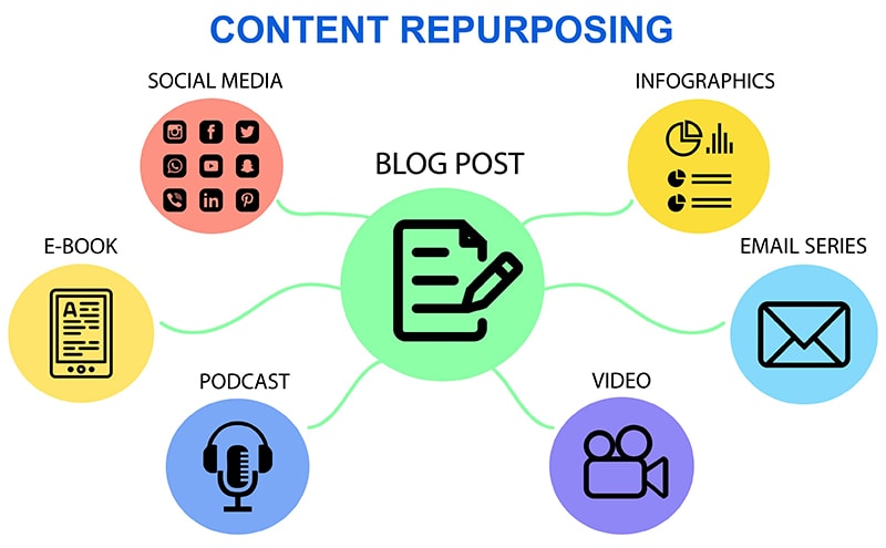
Use High-Quality Images or Videos
Including images or videos in your text makes reading easier and can break up long paragraphs. Some images will also visually enhance your document and help to better convey your message, as well. Science proves that the human brain processes visuals 600 times faster than text. In this way, visual elements are able to present information in a more meaningful way to readers.
Plus, adding videos can serve as a really strong turbocharger for your content: In one survey, more than half of consumers said they want to see more video from the businesses they support. Adding these images and videos might also help you appear in rich search results, helping raise the visibility of your website and driving traffic to your content.
Use High Contrast Colors
On the other hand, to create friendly mobile content, readability would be achieved much more, but increasing readership would be much better with considering font size and color contrast in particular. For example, the font should be no less than 32-point font for the mobile to read it. Besides that, high-contrast colors enhance the aesthetic quality of your content by making it more accessible.
Where white text on a black background represents high contrast, low contrasting colors, including yellow text against a white background, are often hard to read. Poor contrast may also be a problem for color-blind or low contrast sensitivity readers, making high-contrast colors the better choice for the greatest number of readers.
Position Your Call to Action (CTAs) Strategically
With mobile users, one has to be very much aware that they have limited attention; they want the information they are seeking in the shortest time possible, and the moment that is not provided or a clear CTA has not been given within those first few seconds, they are gone.
Because of this, place your CTA at the top of your website in a prominent location. By setting it apart visually and being direct about it, you will more often than not have users take that action through with your desired end. This becomes even more important on mobile, since space is the ultimate premium and every element needs to be leveraged for maximum effect.
Focus on Using Short Title
The title of your content serves as the first impression with your reader, and it plays a large role in how your webpage will appear in search results. Although Google has increased its maximum length of a mobile title tag to approximately 78 characters, experts suggest that it is best if you keep titles brief and to the point. Ideally, mobile titles should be able to appear on a single line in search results.
Do this by limiting your title to no more than six words or about 70 characters. A shorter title is simpler for the reader to process and contextualize. Also, place your focus keyword at the start of your title, making it more search-engine friendly and increasing the chances of people finding your content.
Preview Your Articles Before Publishing
The reason you want to preview your content before going live on mobile is mainly because this is one area we tend to pay a little less attention to than the desktop version. It’s a really crucial part of editing, and that’s going to make sure that your content is error-free and presented optimally on mobile.
Then, when you preview that content on a mobile device, it gives you an idea of what it’s going to look and feel like to the readers, and is a great way to spot opportunities to:
- Break up your paragraphs better
- Add in the appropriate subheadings
- Find where you might want to insert supporting images
- Go through it and know where more whitespace should be added, etc.
A second check on mobile ensures that you do not publish error-ridden content since the publishing of such post reduces the credibility and authority of your brand. Whether these are the creation of mobile-friendly content afresh or updating the existing ones, the tips above will always remind one of how to increase the chances for conversion and enhance the customer journey.
Quality content speaks your message, informs your customers, and ultimately persuades them to use your product or service over that of your competition. Create well-crafted, strategic content optimized for all devices that will let you compete and differentiate yourself from your competitors moving forward in an ever-crowded digital landscape.